In partnership with

Whenever I fly to Europe or Russia, I always stop in Istanbul.
It’s a little ritual I’ve built over the years. Long layover, one night at the Radisson, spa if I have time.
But, come on, the real reason I keep coming back?
The breakfast buffet.
We're talking lentil soup, fresh simit, Turkish honeycomb, olives, five kinds of cheese, baklava at 9 a.m. It’s incredible.
Every time I walk in, I feel this buzz — I want everything.
But I also know I can't. I only have one plate.
So I start circling.
Should I go sweet or savory?
Bread or protein?
Will soup make me too full?
I stand there trying to make the right first move.
And five minutes later, I’m sitting with a cup of coffee and nothing else.
I didn’t lose my appetite.
I lost momentum.
That’s what too many options can do.
They turn excitement into hesitation.
And that’s exactly what happens in SaaS.
Finally, a powerful CRM—made simple.
Attio is the AI-native CRM built to scale your company from seed stage to category leader. Powerful, flexible, and intuitive to use, Attio is the CRM for the next-generation of teams.
Sync your email and calendar, and Attio instantly builds your CRM—enriching every company, contact, and interaction with actionable insights in seconds.
With Attio, AI isn’t just a feature—it’s the foundation.
Instantly find and route leads with research agents
Get real-time AI insights during customer conversations
Build AI automations for your most complex workflows
Join fast growing teams like Flatfile, Replicate, Modal, and more.
Hick’s Law
❝
The more options people see, the longer it takes to decide — and at some point, they give up instead.
It’s a classic behavioral pattern, known as Hick’s Law:
Decision time increases with the number of choices.
But here’s the twist in digital products:
The more powerful or flexible your tool is, the more likely you are to trigger it.
Because you’re not just offering features.
You’re asking people to choose how to begin — and most don’t know.

How we are making it worse by trying to make it better
Teams try to impress.
So they show everything at once.
They think: “If we hide stuff, users won’t know what’s possible.”
But that’s not how people learn. Or commit.
A user signs up, curious and motivated.
But instead of a guided start, they see:
– a dozen templates
– five possible use cases
– an empty dashboard full of widgets they have to configure
– a nav bar packed with features they don’t understand yet
So they hesitate.
They think: “Let me explore a bit before I commit.”
But exploring turns into skimming.
Skimming turns into “I’ll come back to this later.”
And they don’t.
📉 In a 2023 study by Wyzowl, 8 in 10 users said they’ve deleted an app or left a tool because onboarding felt too confusing or slow.
Here’s a move you can steal from Tally to make it right
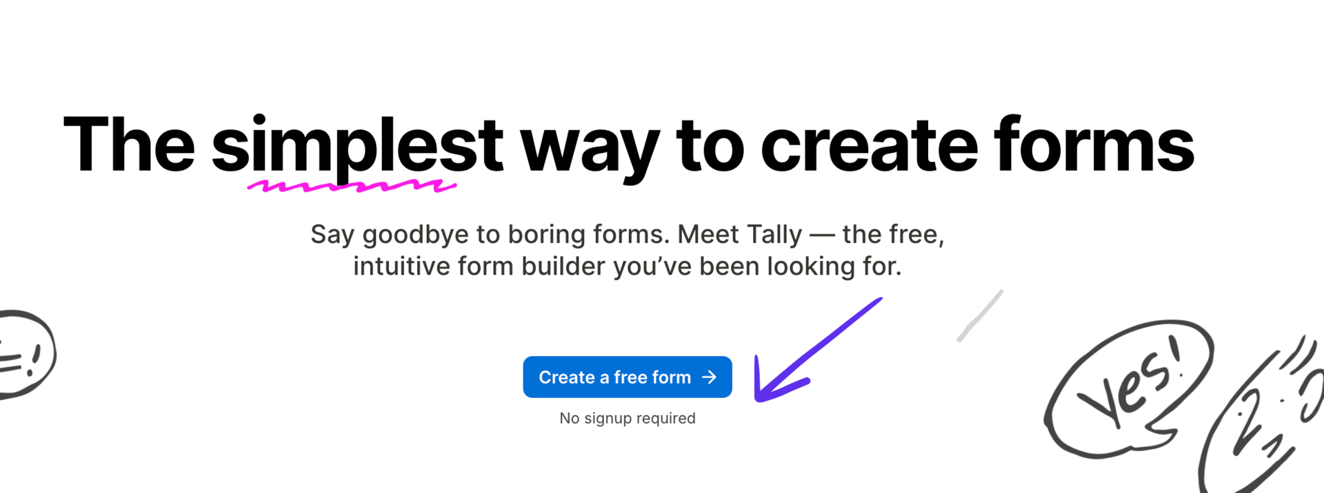
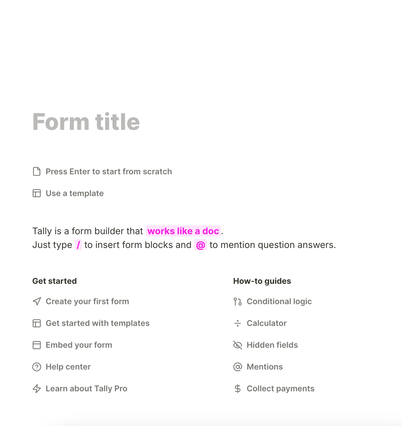
Look at Tally.
When you create a form, you’re not asked to pick a layout, theme, goal, or user type.
You just start typing. The form is the canvas.
It’s frictionless, but not open-ended. You don’t need to choose — you just begin.
That’s the difference.
Users don’t need to see everything.
They need to want something. And that only happens when the choice feels manageable.
3 steps to break this pattern next week
✨ Collapse the number of visible options at the start.
Don’t show 12 templates — show 1 recommendation, and a quiet link to explore more.
✨ Don’t force a big choice upfront.
Let users do something small, fast, and successful — then nudge them to expand.
✨ Offer one safe default.
Even if it’s not “optimal,” it gives people a way to begin.

If you forget everything, remember this:
❝
The more you show, the less they feel.
Clarity doesn’t come from options — it comes from direction.