

Oookay, first issue on Substack, hi everyone!
Have you ever heard that mobile converts worse than web? It was the case almost on every product I’ve touched. And everyone reaches for the same excuse: mobile users are flaky.
They signed up just because they saw an ad, couldn’t be bothered to finish, so we’ll email them later when they’re back at a laptop.
Yes and no. Honestly, seeing half of my friends having their whole lives in their phones, I don’t buy it, not most of the time.
What gets someone to set up and actually pay is the same on mobile as it is anywhere. The rules don’t change. Mobile just punishes you way harder when you break them.
A bloated setup on a laptop is annoying but people push through anyway because the environment is different.
With that same setup on a phone, everything’s working against you. They’re distracted, half-watching something else, doing this standing in a line somewhere.
They have less time to focus, and a mobile screen just takes less physical space in front of them; therefore, as ridiculous as it sounds, it can be perceived as less important.
THE FIND
I was setting up a new event type in Calendly on my phone this week. You know what Calendly is, right? It’s packed with settings, even on the free plan.
But when I want to create a new meeting, I just see this :
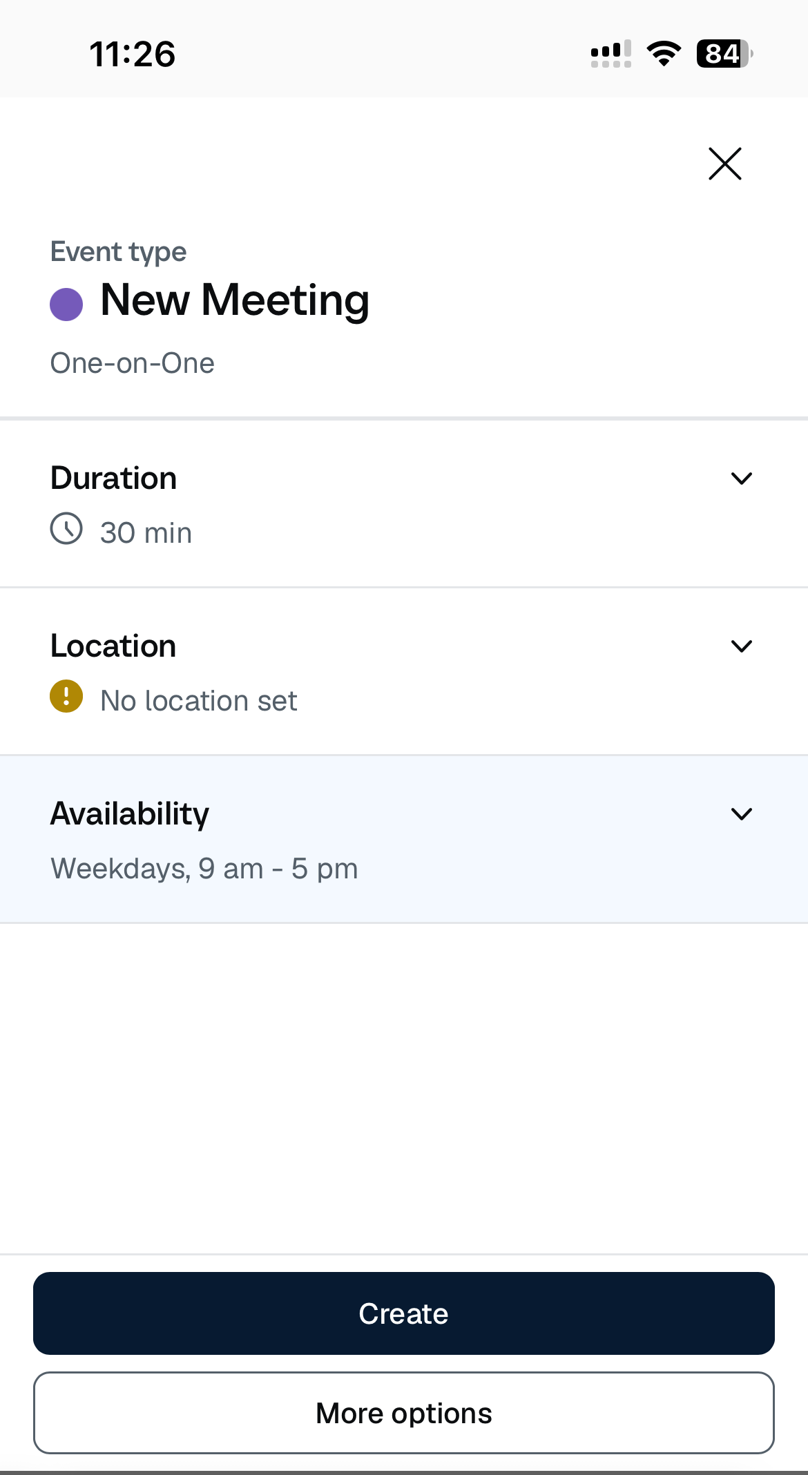
Three things my page can’t exist without, and a Create button. That’s the whole screen. Everything else sits under “More options,” one tap away, for whenever I actually want it.
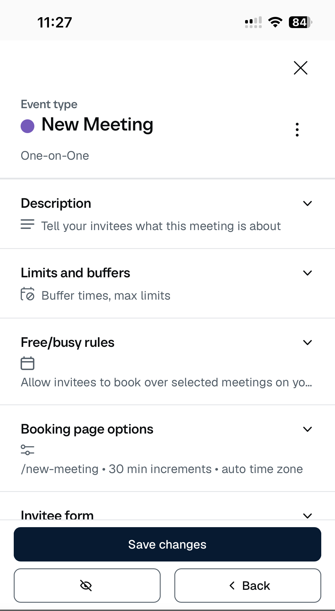
To be honest, this isn’t a mobile-only trick (even though it could have been). Calendly does the exact same setup on web, I checked. I’d just never noticed it there.
On a big screen a clean setup is nice and completely forgettable. On my phone it jumped out, because I’ve been trained to expect the opposite: open a product, get buried in a wall of settings, half of which have nothing to do with me.
WHY IT WORKS
You’ve probably seen the jam study and know about choice overload.
But it’s not the whole story, and the bit that actually matters here is effort.
In 2010 some researchers let people freely pick between two tasks that were basically the same, except one made you switch back and forth more, so it took a little more mental effort. People kept going for the easier one.
And here’s the part that gets me: they couldn’t even tell you which task had been the harder one. We dodge mental effort on autopilot, before we’ve consciously decided anything.
That’s what a maxed-out first screen is up against. Nobody looks at it and thinks “eh, too much, I’m out.” They just feel the weight of it and drift to the back button, and if you asked them why, they’d struggle to tell you.
Now stick that person on a phone.
When we get pulled onto a new thing before we’ve finished the last one, part of our attention stays behind, and we’re slower and sloppier at the new thing for a while. That’s just the default state of someone on mobile. They opened your setup in the middle of something else, running on half a tank.
So the same screen that’s totally fine in a focused laptop session is landing on someone with way less to give it.
So, here it is. On mobile, you have so many forces literally working against your commitment that, of course, converting is harder. But it’s still doable.
THE PLAYBOOK
When to use it:
Any product where people have to set something up before it does anything useful. Scheduling, site builders, workflow tools, dashboards. It matters most when you’ve got real mobile traffic and an audience of small teams or solo people, the ones doing this between five other things on their phone. They’re not less patient than your desktop users but they’ve got more distractions.
How to do it:
1. Give them the smallest version that actually works, and let them launch from it.
Calendly gives you 3 must-have steps to publish a real, working booking page. It doesn’t mean people will publish it and keep right in that setup. But they can preview it, get a general feeling of the result, and come back to editing later.
This is how trust and motivation are built.
Think about it as trying a new dish for the first time. You have no idea if you’ll like it, but if you read just the main ingredients (not all of them, with cooking instructions), you can get a good enough idea if it will work for you.
Same goes for the first step: give me highlights that create the main palette, not every tiny toggle.
2. Hide the rest, don’t cut it.
Every advanced setting Calendly has is still there, one tap under “More options.” A power user goes and digs it out. A newbie never has to look at it. You haven’t taken anything away; you’ve just decided what people see first, so you’re not scaring off your serious users to save your new ones.
Advanced step: if you have different use cases that genuinely appreciate very different core features, customize the first step. Add a profiling question to teh onboarding and link it to the setup people see.
3. Keep the irrelevant, narrow, specific stuff off that first screen.
A setting that has nothing to do with someone’s use case can throw people off: “wait, is this even for me, or for some other kind of user?” And that’s a really expensive question to plant in someone’s head thirty seconds in.
When it backfires:
if your product genuinely does nothing until it’s heavily set up, and there’s no honest minimal version. In this case, don’t try to fake it. Make it scannable, let people play in a sandbox so they can see the potential result. Seriously, take a page out of Amplitude’s book, they are crushing it.
If you forget everything, remember this:
People aren’t there to learn your product, validate it, or be impressed. They also don’t care if you structured all of your features in a very cohesive way that makes sense to developers. They just need the stuff to get started with. Give them one small result to build trust, and they will want to go deeper naturally.
🎉 Woow, you finished the issue, that’s awesome!
Hi, I’m Anastasia Kudrow, and I write Ghosted.
I also help SaaS teams use psychology and PLG to build profitable products that people love using.
Come find me on LinkedIn: https://www.linkedin.com/in/anastasia-kudrow/
Or check out my site, maybe we end up working together:
https://www.ghosted.consulting/
See you next week!