

Hi everyone!
I was talking to a founder the other day who needed help with their onboarding. They had a B2B product, at this point purely sales-led, and the full setup took about a month of work, with a 30-page slide deck within the first session.
I, who mostly works with self-serve, was mesmerized.
“It takes you a month to show the first value?”
“Yes, but what can we do? We must take people through all the correct steps; otherwise, they just won’t see the value afterward.”
It made me think. When we talk about removing friction or designing a fast and smooth onboarding, we usually look at the examples of products that barely require any setup. And even in those cases, things can be far from ideal.
But what about complex businesses that require integration with many datasets and teams, testing in the real environment, and buy-in from multiple stakeholders?
THE CHALLENGE
When the setup of our product is too big to handle, the obvious move is to surface the value and present it in some kind of sandbox. But when teams start discussing something like this, There’s one pitfall they often fall into:
They simplify it too much.
When visualizing the product flows or building a sandbox demo, they get afraid that too much noise and detail will make it hard to engage with. So the visuals get simplified to the point that they look almost cartoonish. In other words, it no longer looks real. It looks like something that resembles the real experience, but any adult would realize that it’s so far from the real thing that it simply can’t be trusted.
But does it actually create an expectation gap in their experience, or is it just a new sexy marketing tactic designed to sell you something?
THE GAP
As I said before, we are getting more and more addicted to instant answers and the ability to engage with almost anything. You can ask a question on a website, go to interactive exhibitions at the museum, and get a 3D AI preview to see how that couch will look in your room.
And the scale of it is new, but the core principle has been there for many years.
We value real things more.
There was a study at Caltech where they measured how much people would bid on different snacks depending on how those snacks were presented.
just a name
name + photo
a real thing that was sitting on the table in front of them
Of course, they valued a real thing more; who wouldn’t?
But here’s a moment that I find interesting. After the first round, they put the real snack behind a sheet of plexiglass. People still could see the snack, but they couldn’t really touch it.
And… the advantage was gone.
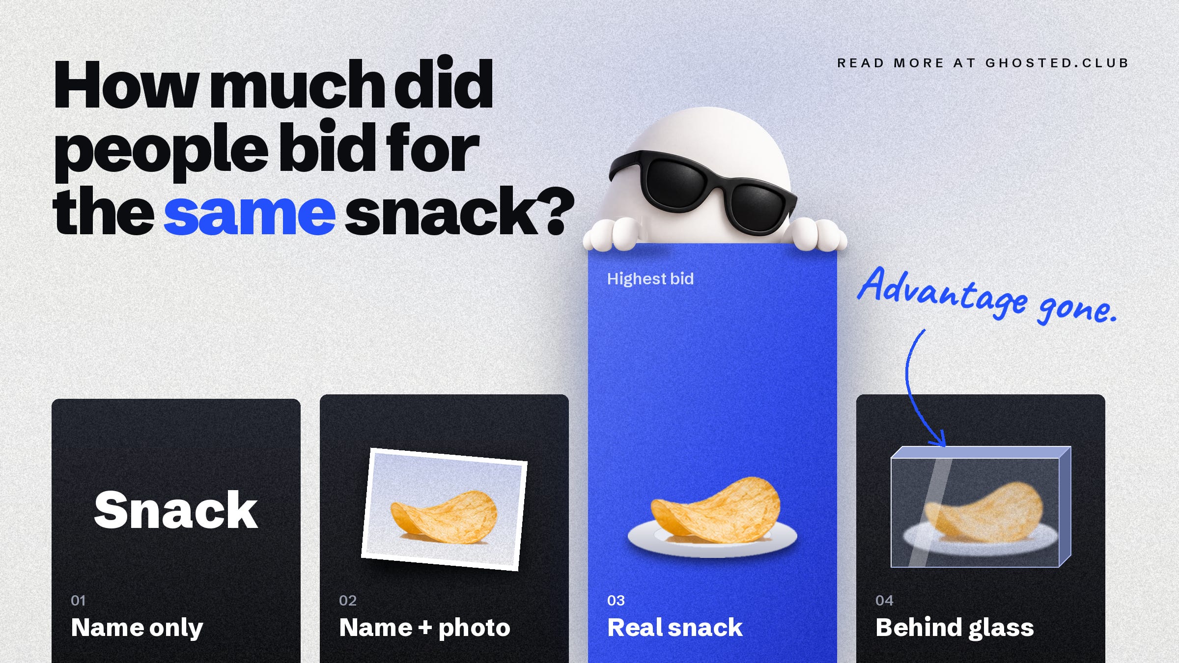
The real thing behind the glass became no more valuable than a picture that people couldn’t feel, smell, or engage with.
The same thing happens when we oversimplify how we present our product during website or demos. We are trying to remove noise but end up handing our users a distant, generic thing they can’t even imagine using.
HOW TO WORK WITH IT
I love how Mercury (a bank for startups) gives you a taste of the everyday experience with their product right on the website.
They have a full-on interactive self-serve demo where you can interact with the account that looks completely real. Quite often, when we do the interactive demos like this, teams want to simplify it to remove all the noise, but the trick here is actually to display details that do look realistic.
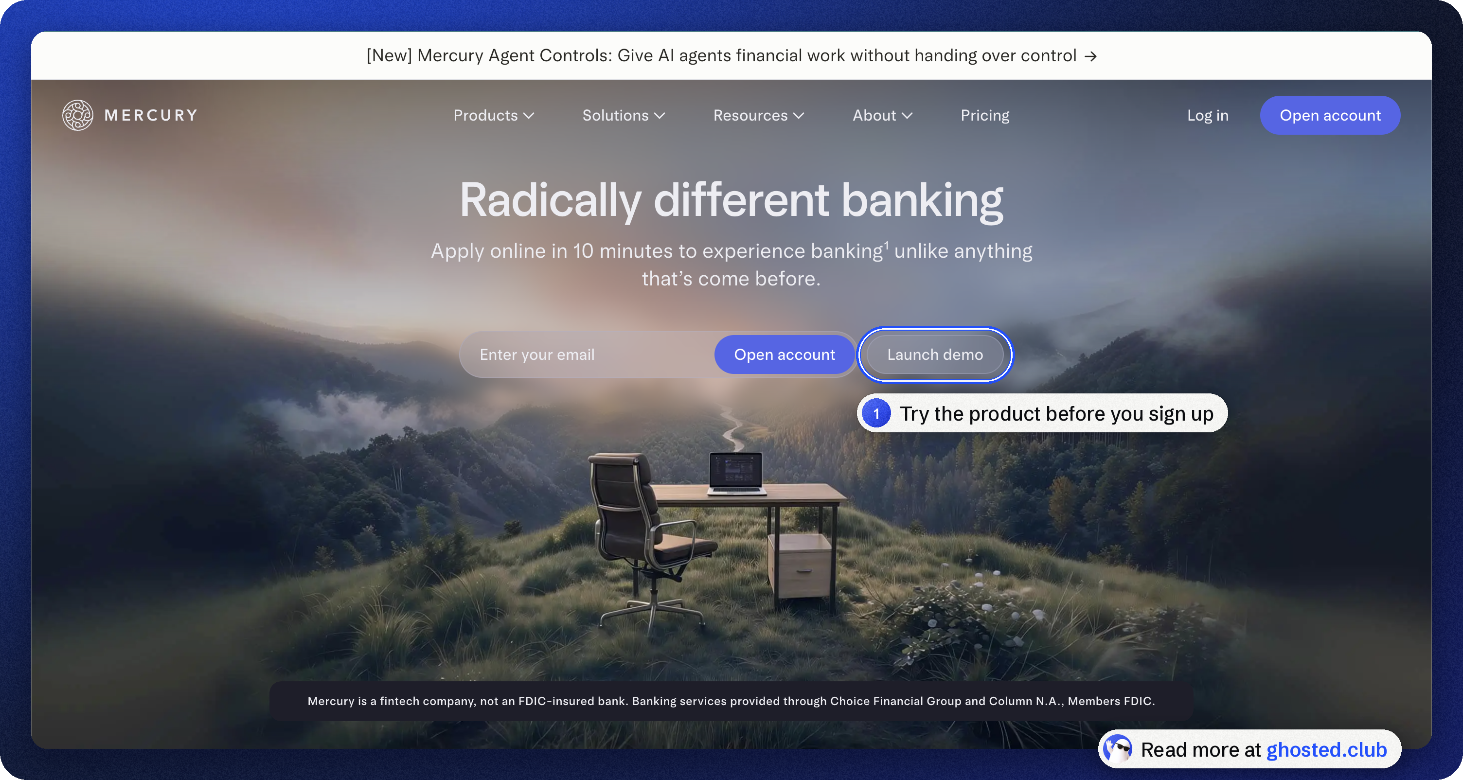
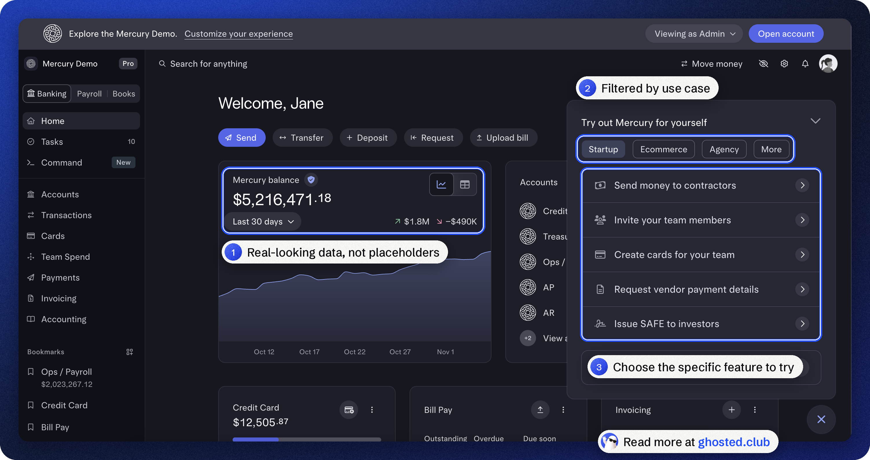
With Mercury, the account is right in front of you, and you can click through it, so you don’t have to imagine how it will work.
So if you have a product that takes weeks to get people to value and it seems like there’s no way around it, start here:
Think, how the daily or weekly interaction with your product actually looks for your core users. What tabs, features, or parts do they use the most?
What does it look like for them when your product is firing at full capacity? Take a screenshot from one of your active accounts and use it as a reference.
Build a clickable, interactive embed with Claude, Codex, or whatever you are using that lets people picture the experience they’ll be working hard to reach. Too many things? Split by use cases.
Of course it’s only one example, and it seems so simple that I’m surprised how little people use it. But it is a small step that can already help people see the final result while they are doing the long setup run.
Next week we will talk about how to bridge the same gap when it comes to locked features, onboarding, and upgrade motion.
ONE THING TO REMEMBER
If you require people to do the work before they see the value, the experience matters as much as the potential results. Show them what they will get and what their daily experience with your product will look like. This drive will keep them going.