

Hi everyone,
This week I spoke at MicroConf, breaking down how AI changed onboarding and activation. One thing I noticed is that the absolute majority of those changes lead to adding an AI chat to the product .
When I was screenshotting solutions for the research, I had a feeling that all our products started to look the same. It’s not only because we use a lot of the same brand systems, especially small startups. It’s also because the same solutions keep getting adopted.
So I started wondering, does designing everything around the AI chat take away your product’s individuality? This is something I would love to dig into today.
THE CHALLENGE
Should you add an AI chat to your product, or keep your product unique?
When I first started working with UX, one of the first pieces of advice I got was that if a specific element sits in a specific position in all the major products, you should put it in exactly the same place. For example, if the search icon is always in the top right corner, you should put the search icon in your product in the top right corner as well, because this is where people will expect to see it.
For years products did look different from one another, but the core elements were universal and recognizable. And it’s not because no one has fantasy. It’s because it’s important. It bridges the expectation gap and helps people navigate and scan the product quicker, so they spend less time learning the rules and more time actually using the product.
And I think right now we are about to be in the situation where it gets to the absolute extreme, because every product is about to look like an AI chat. Quite complex products add AI chat as their core interface decision, as their core input point.
A lot of teams hesitate about this decision because they’re afraid they have to rebuild their whole product and replace it with the chat. But this is not what this is about. And here’s why it can do more good than damage if you approach it right.
THE GAP
Researchers showed forty people screenshots of real websites they had never seen, and asked them to spot one thing as fast as they could, like the login on an online shop. On some sites it sat where most sites put it. On others it sat somewhere else. An eye tracker followed every look.
When the login sat in the usual spot, people found it in under a second. When it didn’t, it took them three and a half seconds and about 14 looks.
This is exactly what happens with the AI chat interface right now. If we don’t have a thing we can just talk to, it opens an expectation gap.
You can argue with me and say, “Hey, Anastasia, we’ve had search engines for years, and it’s not like they shaped our perception of how the product should look.”
Well. Hold on.
Almost every product on earth had and still has a search bar where you can go and search for something, because this is such a typical behavior. All of us have been doing it multiple times a day for years. And right now, that search bar turned from searching for information into an AI chat. A thing I can simply ask to do stuff for me, to save myself some time and cognitive effort.
I remember many years ago I was working on a media project, and users were begging us to add a search function to the website because we didn’t have it. But after we added it, less than 1% of people were actually using it, and they weren’t using it very often. But the absence of it was so annoying to people that they could not let it go. They wanted everything to look the same. They wanted to know that if they need it, they have this capability.
HOW TO WORK WITH IT
It doesn’t mean you have to erase your whole product and replace it with a chat. But it might be a good idea to use the chat as a door into your product.
Here’s how teams do it.
1. Make the chat the main way in.
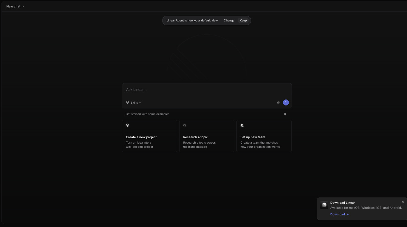
Linear made its agent the default view. The whole home screen is one box, “Ask Linear,” with a few examples underneath. You can change the look, but if you don’t, the chat is the main way you work with the product.
2. Keep it always there, but subtle.
Miro puts a small chat bar at the bottom of every board, “Where shall we start?”, with a few suggested prompts above it. It’s easy to ignore, and when you click it, it expands. The canvas and tools stay the main thing.
I especially love that one of the suggested prompts is “Learn Miro AI.” People come to products like Miro with very different knowledge of how to use them, very different intentions, and very different images of the result they want in the first session. Sometimes figuring out what the product can do is the result. So the chat isn’t designed only around things that produce a direct output, but also around learning the product, if this is what you’re here for, so you can plan your work around it in the future.


3. Put it next to other ways in.
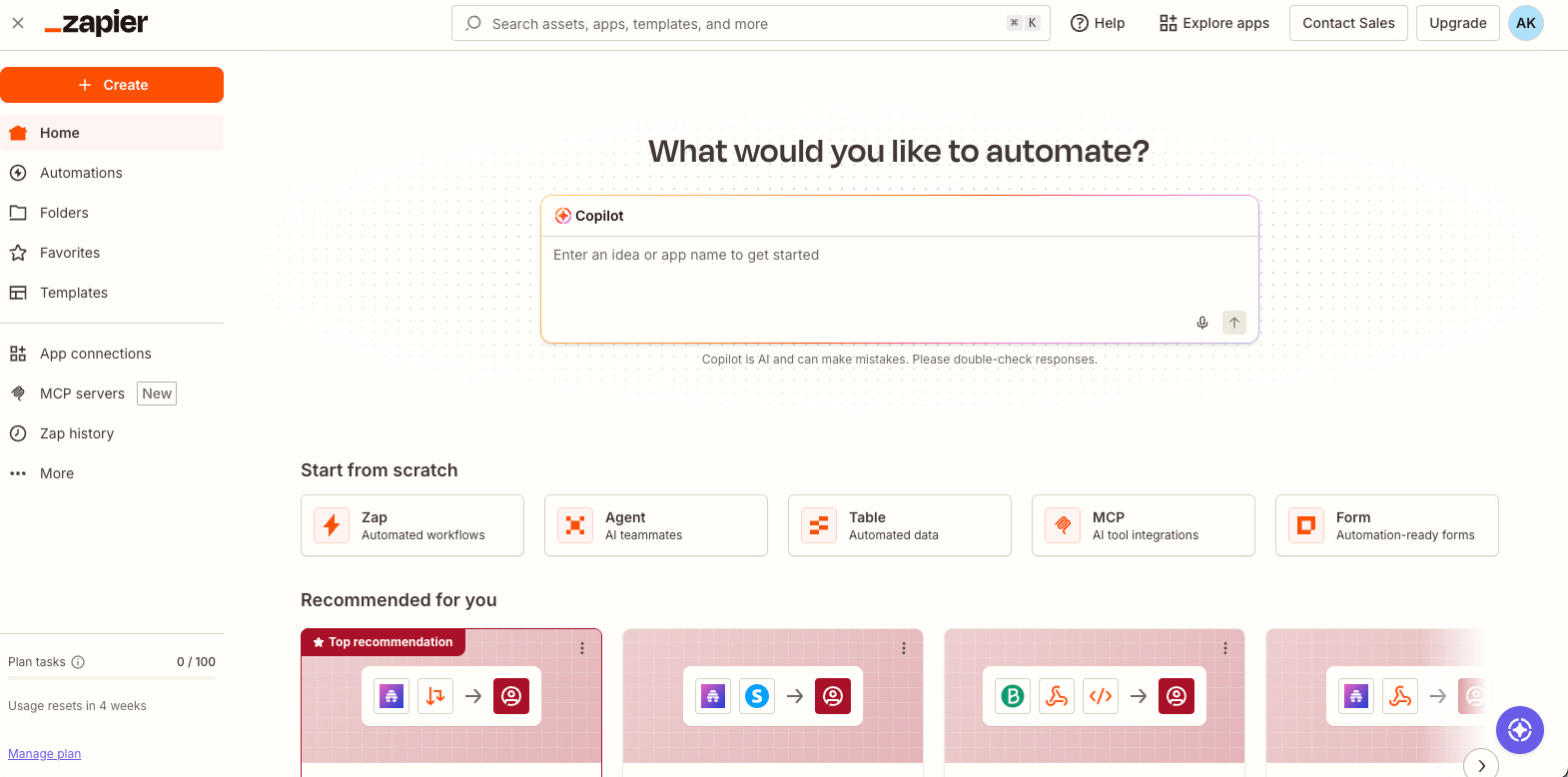
Zapier does something in between. The chat is the obvious option at the top of the home page, “What would you like to automate?” Below it sit other places to start, from scratch or from a recommended template, which help you get oriented if you’d rather click than ask.
N.B. There’s a concern that if people learn how to use something through the AI chat, they won’t learn the actual journey in the product. Well, maybe they don’t have to? Just make sure that if I can use some functionality through the chat, I can use it again and again, and it performs well every time, not only during onboarding. If you let me see the magic during onboarding, but then it’s impossible to recreate it in the product, that’s bad.
ONE THING TO REMEMBER
Don’t try to be unique at the cost of being inconvenient. You can follow the new UX habits without losing what makes your product special.